Projects
The Objective
Build a conversion-focused website and client management flow for a local junk removal business.
I originally hired Weekend Warriors to remove over a tonne of concrete from my backyard.
They showed up on time, worked efficiently, and were genuinely easy to deal with. There wasn't any friction, upselling, or humming and hawing over how much concrete there was to remove. They had genuinely great customer service and even raked up my leaves afterwards.
As they were wrapping up their work, I started chatting with Ethan and Paul about their digital presence and offered some tips on how they could improve their SEO. It wasn't long before we started discussing updating their website to make them more competitive in the local junk removal market.
At the time, they were booking maybe 3–4 jobs per weekend. Most of their growth was by word of mouth. They were also paying upwards of $700/month for SEO and marketing services that weren’t generating the results they wanted. Once I began consulting with them and helped move their business management processes over to Jobber, things shifted. Bookings picked up, and then kept picking up, to the point where they’re now fully booked most weekends.
Reviews followed the same pattern (thanks to Jobber automatically prompting their customers after a job was completed). They went from around 15 reviews on their Google Business profile to nearly 200 in a six month span, all while maintaining a 5-star rating.
The website redesign came in after that momentum had already started. While it wasn’t the initial driver, it helped sustain it. As more people found them, the new website made it easier to understand what they do, trust them quickly, and book without hesitation. It aligned their online presence with the quality of their actual service and made sure that increased demand didn’t get lost along the way.
Before: Landing Page
Their original home page looked great at the top, but as you scrolled down, there were paragraphs upon paragraphs of information about Ethan, Paul, and their business. There were multiple competing calls to action, but they were buried in all of the information further down the page.
However, they did have social proof in the form of a testimonials carousel near the bottom of the page (not pictured).
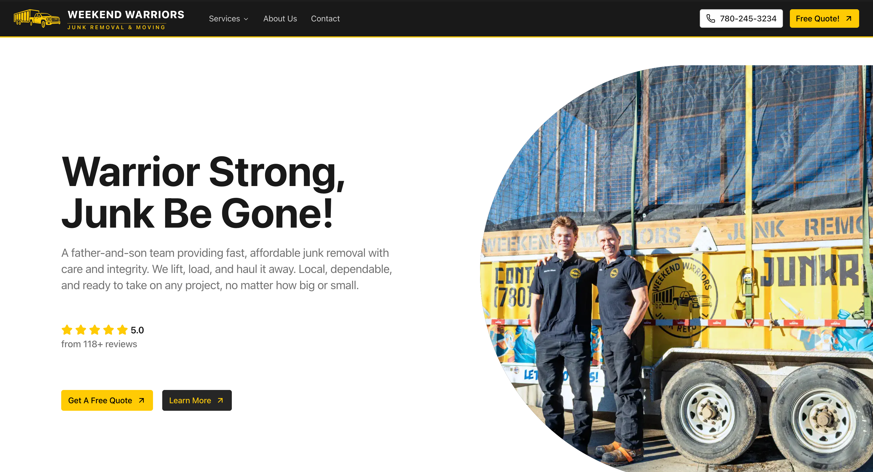
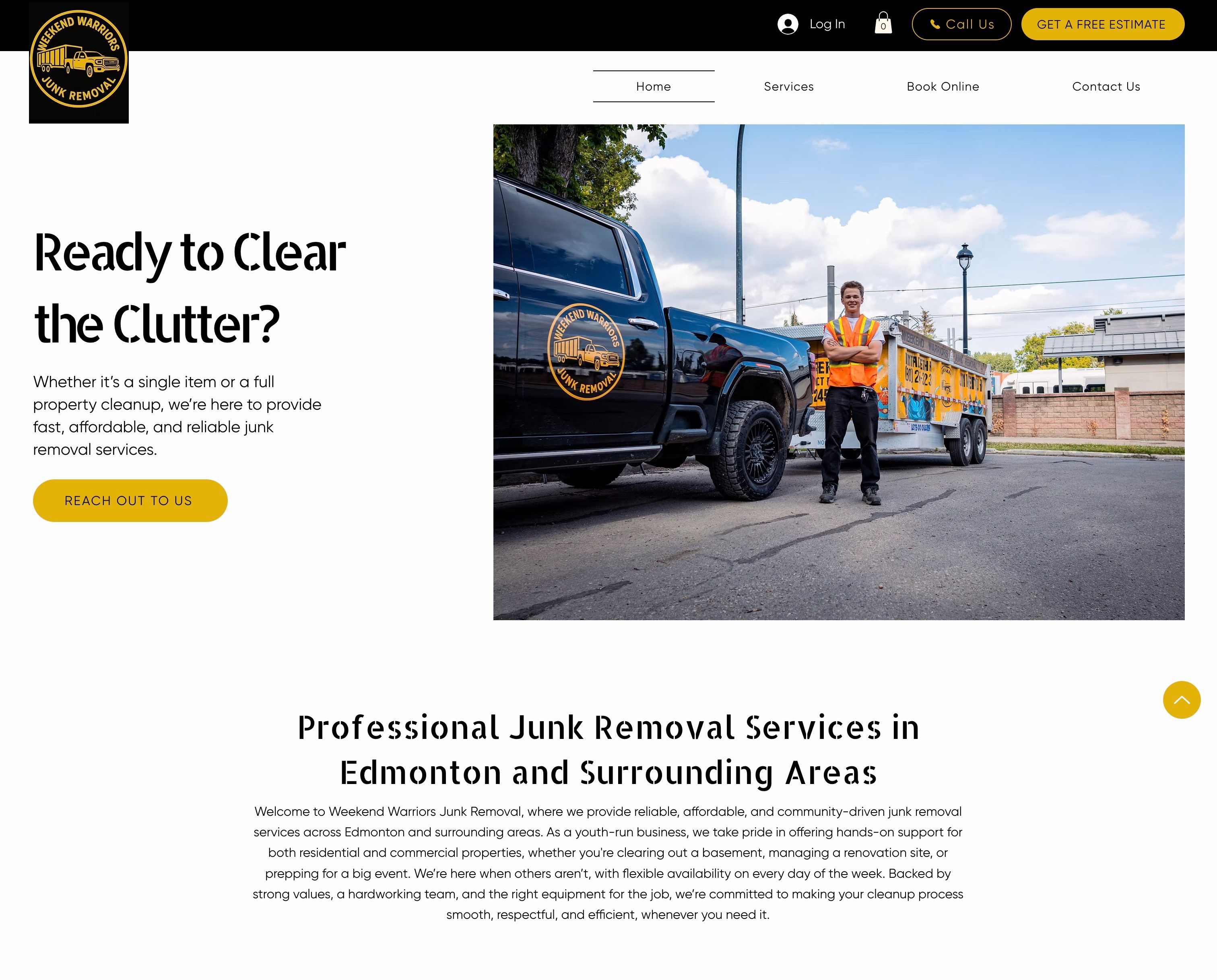
After: Landing Page
The goal with the new homepage was to remove as much friction as possible. Most people landing here already know they need junk removed—they’re just trying to figure out if this is the right company and how to book. So the focus was on making that decision easy. Show what they do, show where they operate, reinforce that they’re legit, and make the next step obvious.
Ethan sent over a few sites for me to use as inspiration and pointed out what stood out to him. He wanted to keep it simple, keep it real, and to avoid over-designing it, so I kept that in mind throughout the process.
One small interaction I introduced was a hover state on the service images that reveals a before/after view. It’s subtle, but it gives people a quick sense of the kind of transformations they handle without needing to read through a bunch of text. It also reinforces the outcome, which is ultimately what most customers care about.
Before: Services Page
Each service on the Services page for junk removal and demolition was presented the same way, so nothing stood out or felt specialized. It focused on describing offerings instead of guiding users toward booking, and left out the practical details people care about—like what to expect, how disruptive it is, or whether cleanup is included. Overall, it provided some information, but the user would have to track down the booking button at the very top of the page in order to start the process of booking a service.
After: Service Pages
Each service now has its own dedicated page, which made it easier to focus on what people actually care about for that specific job.
At the top, I added a header image showing Ethan, Paul, or both of them in action. It’s a small detail, but it immediately reinforces who’s doing the work and builds credibility before you even start reading.
From there, the page is structured to support decision-making. I added social proof directly into the page so people don’t have to go looking for it, and placed calls to action throughout—after key sections, not just at the top or bottom. The idea was to catch people at the moment they’re ready, instead of making them scroll back up or hunt for the next step.
Overall, the pages are less about describing the service and more about helping someone feel confident booking it.
Before: Contact Page
The contact page had the right pieces—contact info, a form, and a brief introduction—but it didn’t quite guide the user toward taking action. It opened with more context than needed at that stage, and you had to scroll down (below the fold) in order to access the contact form.
Overall, it worked, but it wasn’t making it especially easy or obvious for someone to reach out quickly.
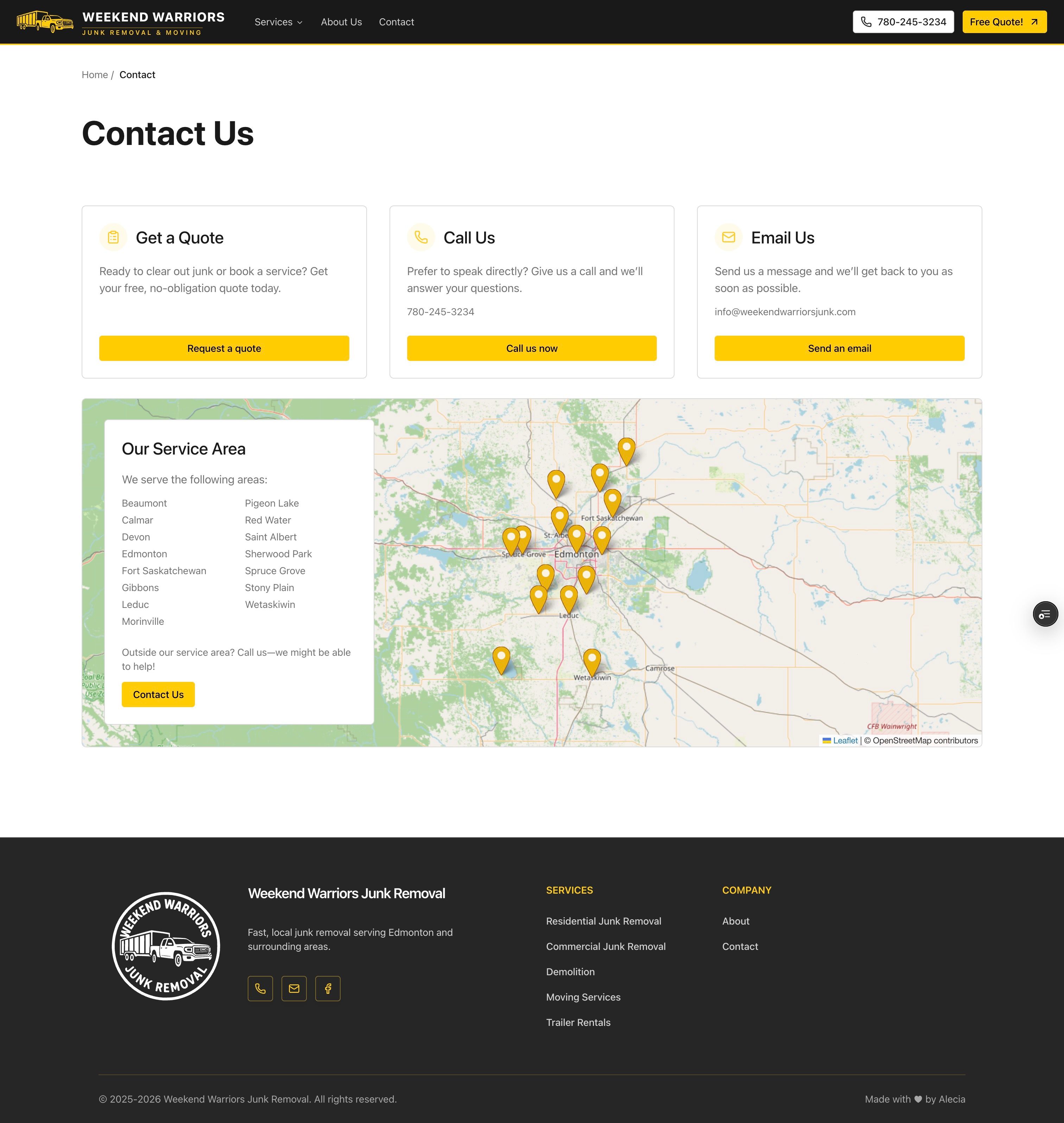
After: Contact Page
The goal with the new contact page was to make reaching out feel quick and obvious. By the time someone gets here, they’ve already decided they’re interested—they just need a clear way to take the next step.
Instead of embedding a traditional contact form, I used a Jobber quote request form as the primary action. It’s triggered through a button and opens in a new tab, which keeps the page itself simple while still routing everything through the system they use to manage their business. That way, they’re not dealing with duplicate inputs or juggling multiple sources of information.
I also broke out the main contact options—get a quote, call, or email—so people can choose what feels easiest. The quote flow is the default, but nothing is forced.
I included a map of their service area to answer a common question upfront: “Do they service my area?” It’s quicker and more intuitive than reading through a list of cities, and it reinforces that they’re local.
Overall, the new page keeps things simple on the front end, and consistent on the back end.
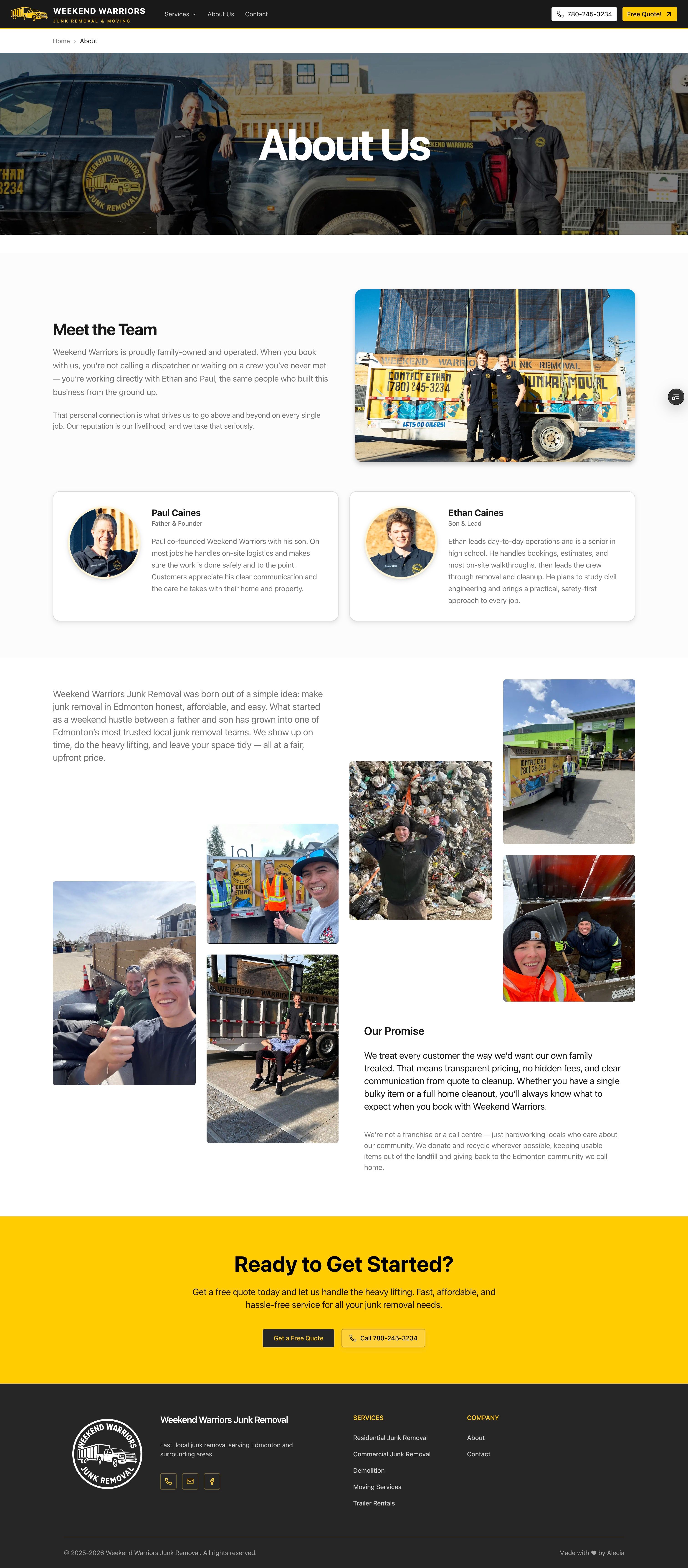
After: About Page
I added an About page fairly early on in the project because I felt that something was missing. You’re inviting a company onto your property, sometimes for work that is messy or even a bit personal, and there was no clear sense of who was actually showing up. While Ethan was the face of their original site, it was important to him that the new website emphasized the father and son aspect of their business.
My goal with this page from a marketing standpoint was to give people a sense of what it’s like to be around Ethan and Paul before they reach out. There’s an inherent risk in hiring a small, local operation—especially when it’s easy to assume “a teenager and his dad” might not be as reliable as a larger company. At the same time, this was an opportunity to differentiate Weekend Warriors from bigger junk removal companies by making the experience feel more human and less transactional.
I placed their headshots and more polished photos at the top to establish credibility right away. Below that, I added a collage of candid, on-the-job photos that show that they’re out there doing this every weekend, that they take pride in what they do, and that they actually enjoy it!
Alecia took the time to truly understand our business, our target audience, and the image we wanted to present. The final website reflects all of that. It is clean, modern, easy to navigate, and perfectly aligned with our vision.— Paul Caines, co-founder of Weekend Warriors
With over 20 years of programming expertise, I specialize in turning complex ideas into impactful, user-focused solutions. From developing and maintaining products used by millions—like video chat platforms and exam software—to creating custom dashboards and levelling up SquareSpace, WordPress, and Wix sites, I can execute your vision from concept to completion, from frontend to backend, and everything in between.
I don’t just build software; I solve problems, streamline processes, and deliver results to maximize your online presence.