Projects
The Objective
Streamline timesheet tracking & improve employee engagement.
During Spring and Summer 2019, I undertook the challenge of redesigning Cybera’s timesheet system to address usability issues and give the platform a modern, professional look. The previous system relied on a dated table-based layout with minimal styling, which often frustrated employees and made tasks like filling in missing hours at the end of the month unnecessarily tedious. The lack of visual indicators and filtering options created inefficiencies for users and added extra work for the finance team.
The redesigned system introduces a clean card-based layout that highlights key information, such as missing hours, with red banners for quick action. Employees can now filter entries to streamline workflows, while the overall design prioritizes simplicity and clarity. These changes not only make the platform easier to navigate but also help foster accountability, reducing the need for the finance team to follow up with users at the end of each month. Below are screenshots showcasing the transformation and key features of the new system.
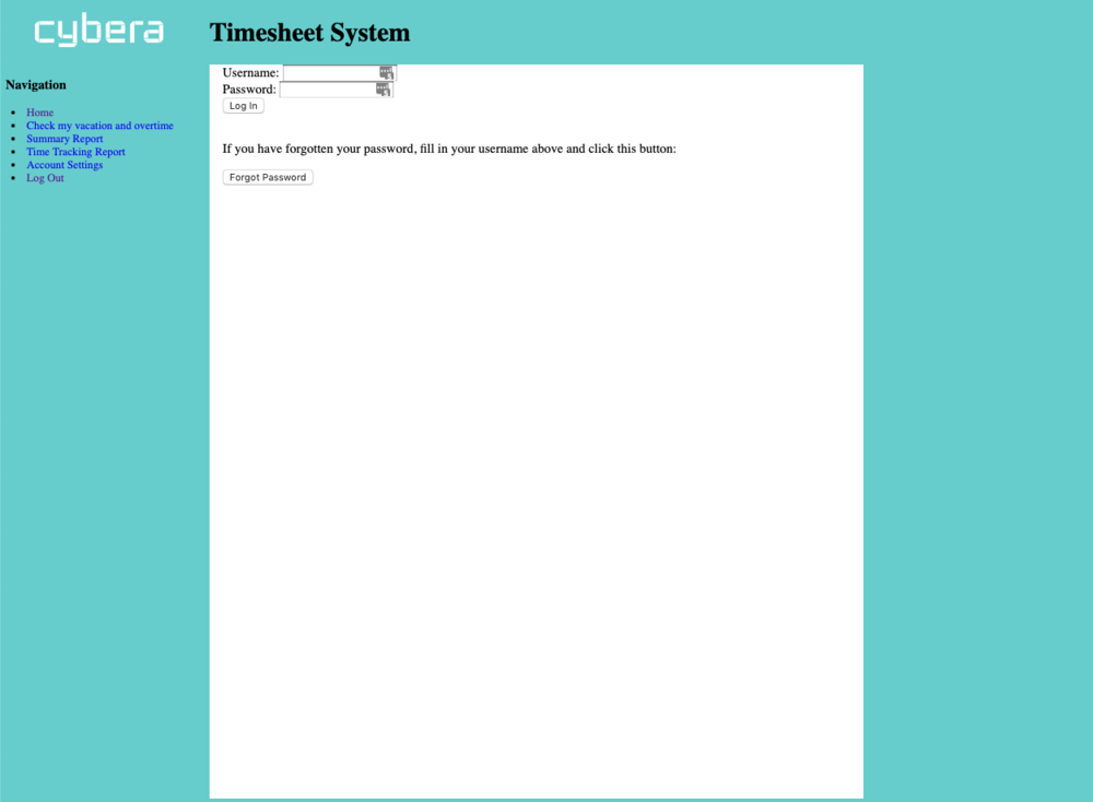
Old Login Page
The old login page of Cybera’s timesheet system featured a very basic design with minimal styling. The plain teal background and lack of visual hierarchy made the interface feel outdated and uninspiring.
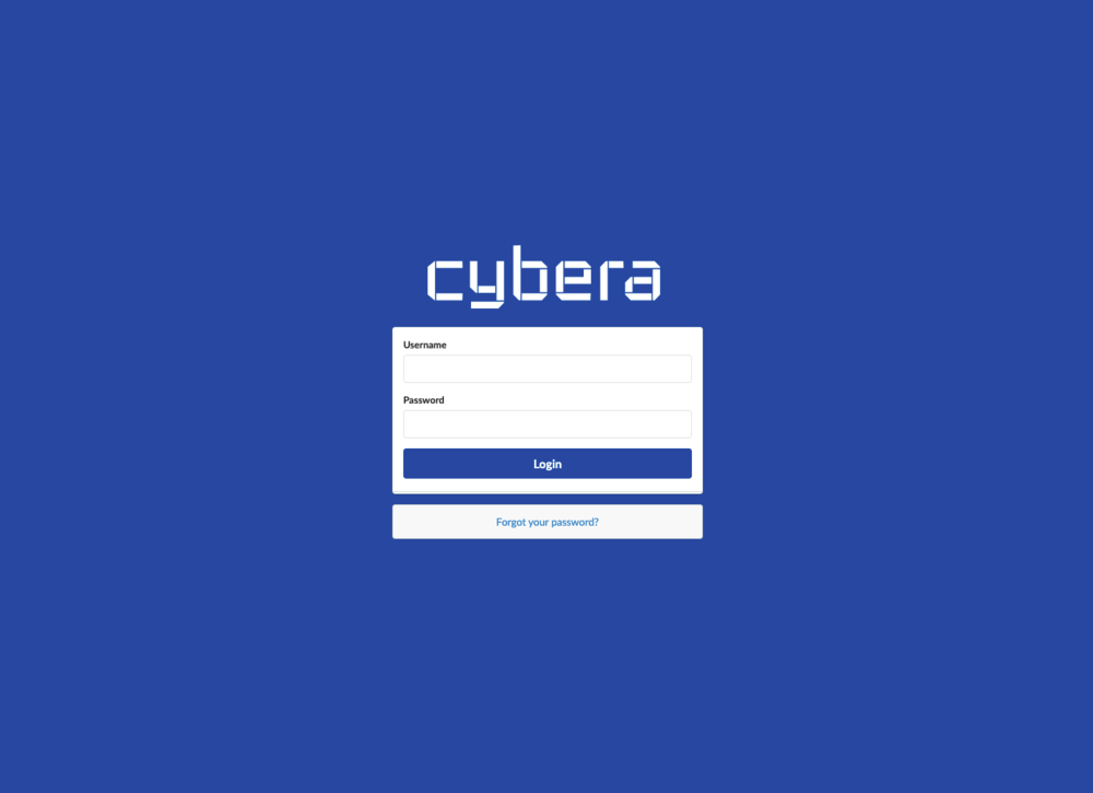
New Login Page
The redesigned login page for Cybera’s timesheet system offers a clean and professional look, with a bold blue background and a centered login form that improves focus and usability. The updated design incorporates the Cybera logo for branding and features clear input fields, a prominent login button, and a ‘Forgot your password?’ link for easy access to account recovery. This overhaul ensures the first interaction with the system reflects a modern and user-friendly experience.
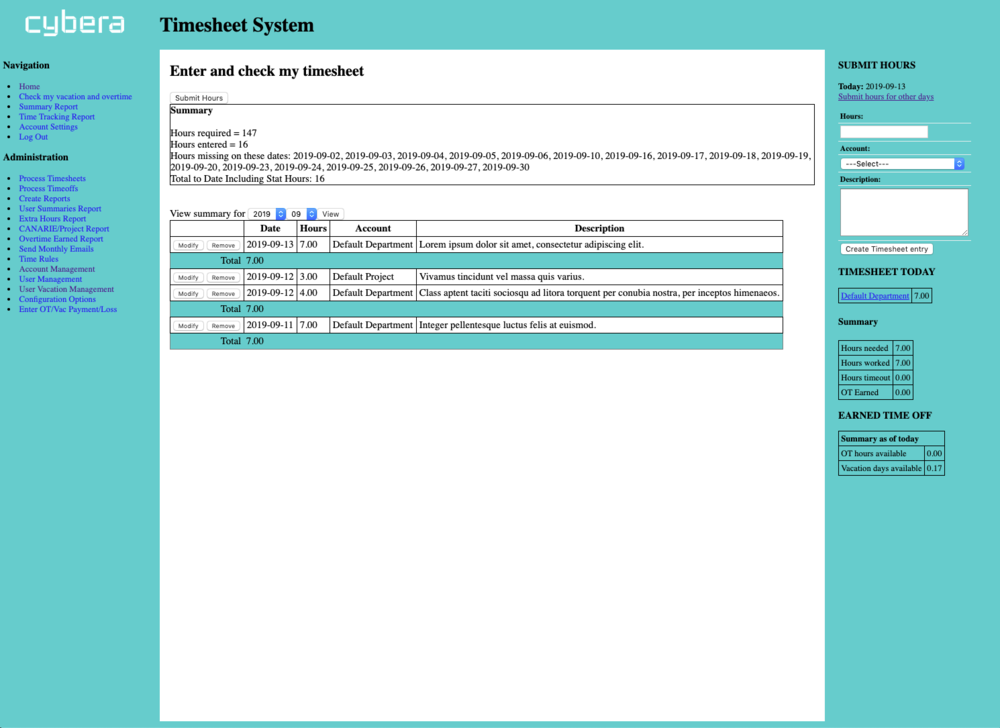
Old Dashboard
The old version of Cybera’s timesheet system relied on a basic table-based layout with minimal CSS styling. Its outdated design, reminiscent of early web conventions, made navigating the platform cumbersome and visually unappealing. Employees were provided with plain-text lists of dates and hours, which lacked visual cues to indicate missing entries or important deadlines. While functional, the interface fell short of delivering a user-friendly experience or reflecting Cybera’s professional standards.
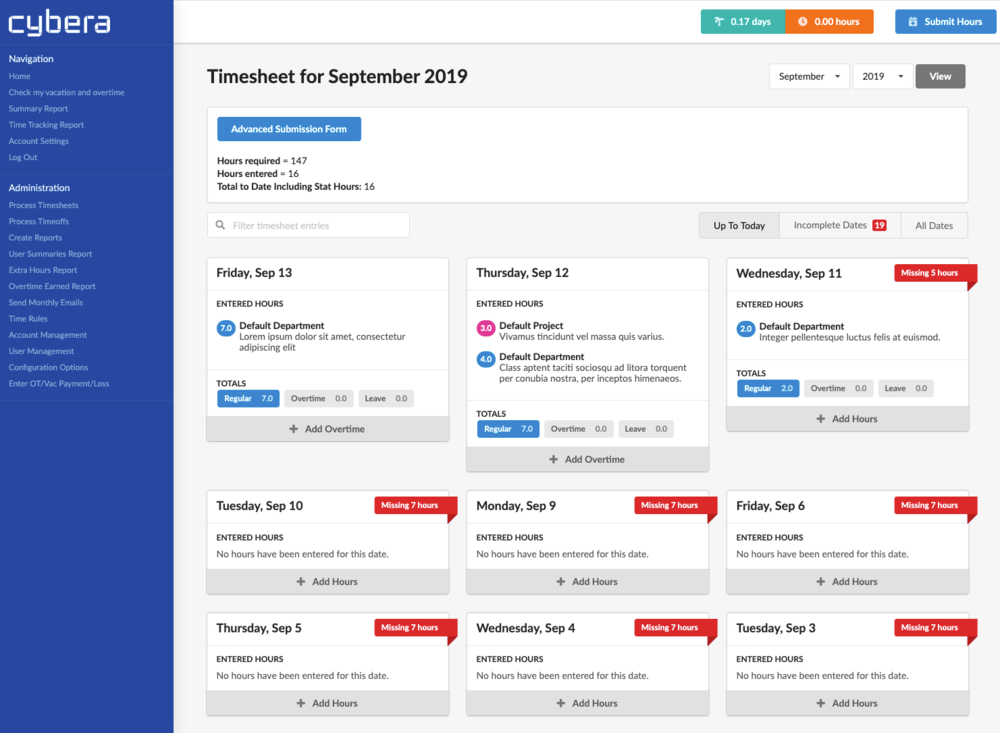
New Dashboard
The redesigned timesheet dashboard for Cybera’s system introduces a modern card-based layout that prioritizes usability and clarity. Each card represents a date, showing logged hours or indicating missing hours with bold red banners for quick visual identification.
The layout features intuitive navigation on the left and actionable controls, such as the ‘Advanced Submission Form’ button and progress indicators, at the top. These improvements streamline timesheet management, making it easier for employees to track their entries and meet deadlines.
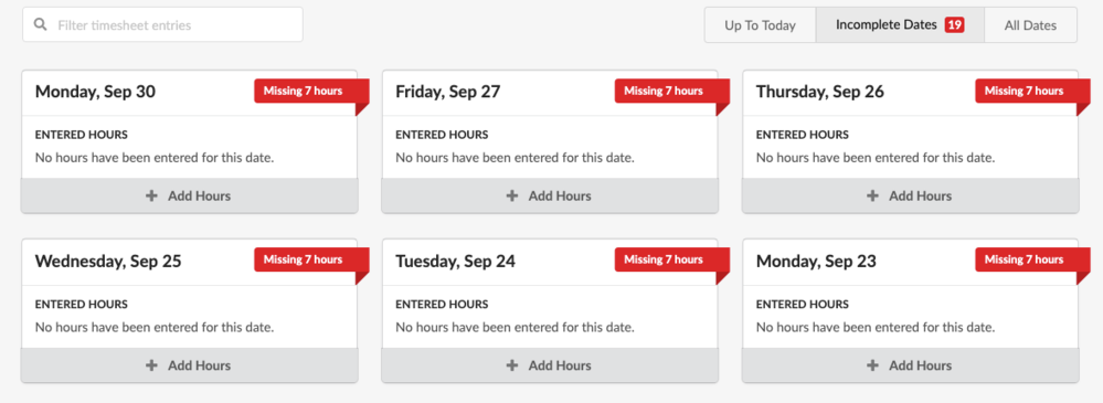
New Feature: Reactive Filters
The redesigned timesheet system introduces responsive filters that allow employees to quickly view dates with missing hours for a specific month. This feature replaces the plain-text list of dates from the old system, providing a clear and visually engaging grid of date cards. Red banners on the cards highlight missing hours, making it easier for employees to identify and address incomplete entries with just one click.
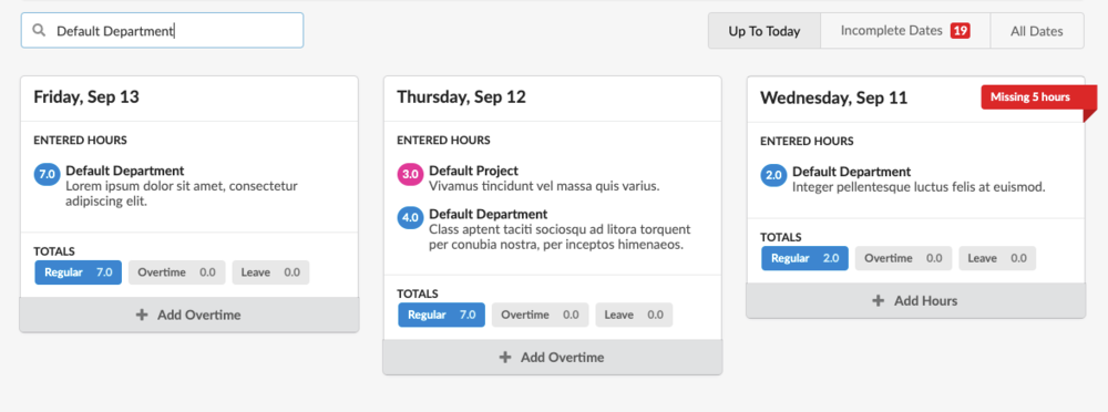
New Feature: Fuzzy Search
The redesigned timesheet system includes a powerful new search feature, allowing employees to filter their monthly entries by specific words or phrases. In this example, the user searches for ‘Default Department,’ and the system dynamically displays only the relevant timesheet entries. This feature streamlines the process of locating specific data, saving employees time and effort.
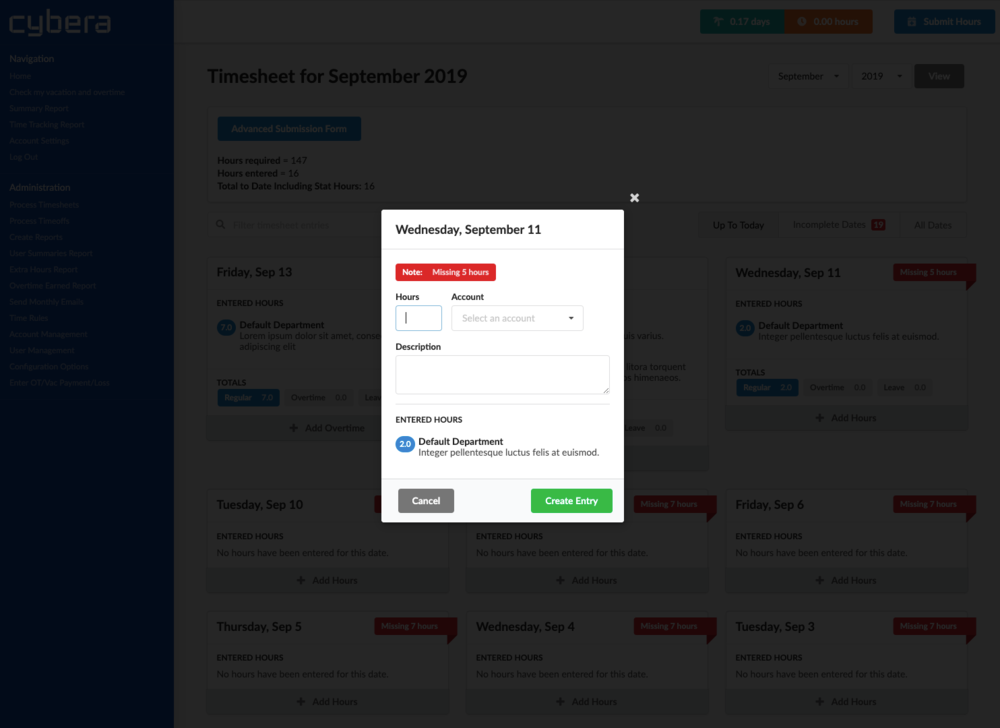
The redesigned timesheet system replaces the old method of navigating to a separate page to enter hours with a sleek, modal-based solution. When adding an entry, a modal window fades into view, displaying a reminder of the missing hours for the day and any existing entries at the bottom. The account selection dropdown now includes autocomplete functionality, making it faster and easier for employees to select the appropriate account. This approach streamlines the process and enhances the overall user experience.
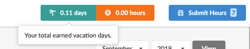
New Feature: Fixed Header
The new fixed header replaces the old sidebar that appeared on the right, providing a more compact and less intrusive way to display key information.
The header stays visible at the top of the page when scrolling and includes totals for vacation days, overtime hours, and a ‘Submit Hours’ button with a real-time indicator of missing hours. This streamlined design frees up screen space while ensuring essential data is always accessible.
With over 20 years of programming expertise, I specialize in turning complex ideas into impactful, user-focused solutions. From developing and maintaining products used by millions—like video chat platforms and exam software—to creating custom dashboards and levelling up SquareSpace, WordPress, and Wix sites.
I don’t just build software; I solve problems, streamline processes, and deliver results to maximize your online presence.